
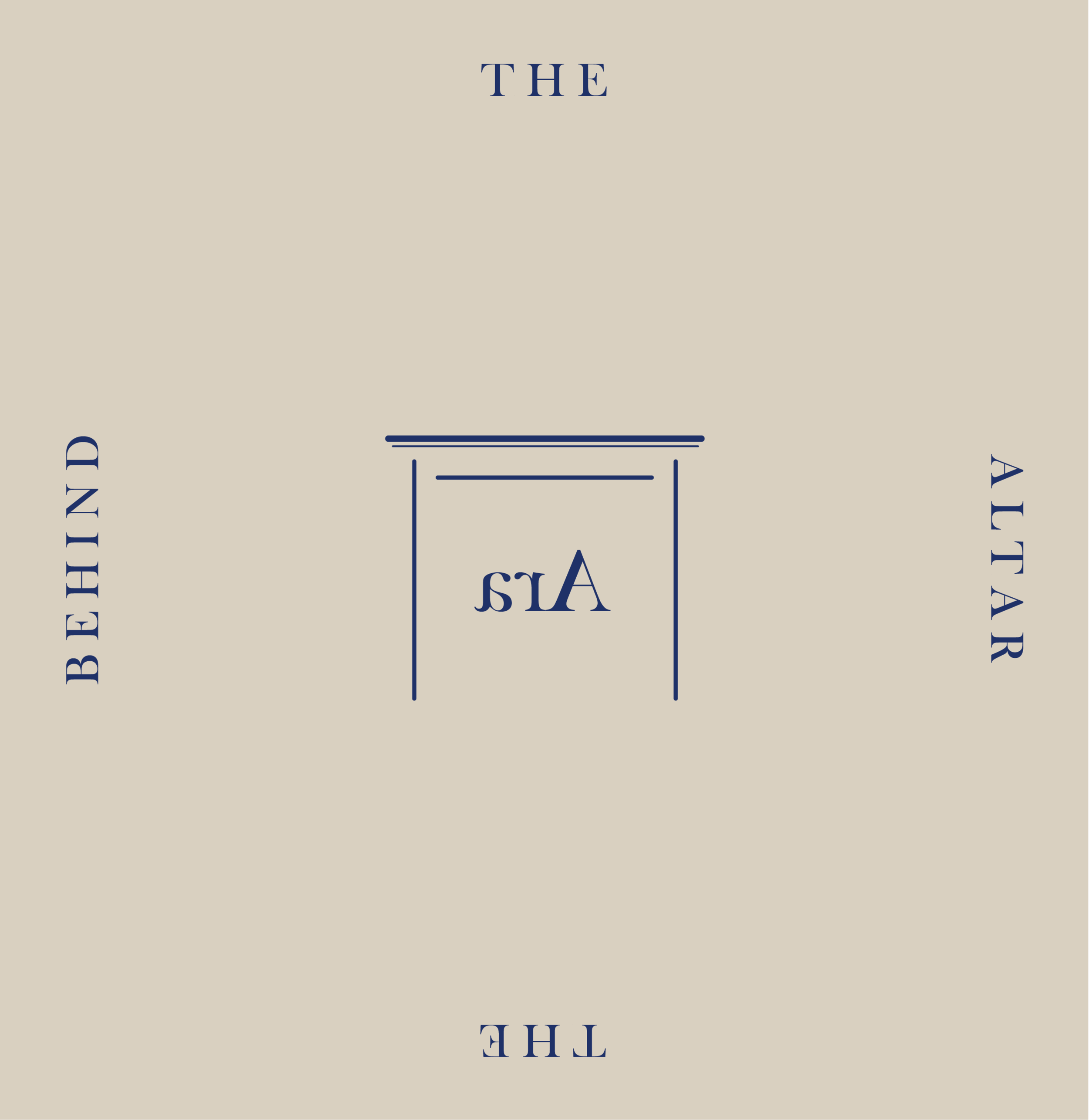
Behind the altar | Vol. 1 Branding
WELCOME
to
BEHIND THE ALTAR

On the bench — wax work
Welcome to the first volume of my new project, Behind the Altar —
A place to take you behind the altar to explore what really goes on behind the scenes — on the bench, on set, and anything else you’re curious to know.
Expect unpolished content, grubby fingers and a proper peek at what goes into making Ara a responsible brand.

VOL. 1 — BRANDING
For Volume 1, I thought it fitting to return to the beginning of my journey and explore the branding that captures the foundation of Ara in graphic form.
One of the things I love most about managing my own small business is all of the creative aspects I get to play with, a favourite being graphic design.
I am no expert when it comes to graphic design with no training or experience but feeling so close to the brand and it’s portrayal —and launching my brand without any financial support— it was something I was really keen to have a stab at myself.
I thought I’d walk you through the journey I’ve taken with Ara’s branding so far — from where it began to where it is now. You will likely recognise this pool of graphics from across my website, packaging, accompanying cards and stamps, and across platforms — in the content I share on Instagram and in Letters of Ara.

Adding graphic elements to my sample sale imagery
THE SOFTWARE
—
I use Adobe Illustrator for all of my graphic design. Anything from branding to Instagram posts and the monthly graphic illustrations I used to create for Letters of Ara see them here.
This programme gives me scope to create something completely unique to Ara. I pay a monthly subscription which gives me access to other programmes like Photoshop and Lightroom which also enable me to edit all of Ara’s images myself.
Something I’ve found tricky with graphic design is the limitless possibilities it permits. I’m admittedly not the most decisive person and with so many potential design directions to explore, I find it really tempting to explore different avenues and hard to commit to one in particular.
So my main approach is to play. I try and work fairly intuitively and that way I can learn the skills needed for a particular task as I go, rather than feeling overwhelmed to learn everything.
The original logo
WHERE IT BEGAN
—
THE LOGO
In 2017 I sat down with a blank illustrator document and literally wrote the words Ara the altar in about 40 different (but very similar) fonts. I wanted to find just the right fit at this stage to create a logo I could commit to and something I knew I’d love for years to come.
From the offset I had some little hand sketched symbols in mind but when attempting to incorporate them into my logo it just felt too busy. No matter what I tried, I kept coming back to a simple line to separate Ara and the altar. Ara translates from Latin as the altar so this added some distinction as well as visually translating the brand name. I decided to use the sketched element for the line to add a hand drawn aspect to the design.
As various apps and platforms require branding to fit within particular shapes and dimensions, I also needed to create a logo that would fit into a square or a circle. For this, playing around with the original logo layout led me to stack the words in a way that created more of an ‘altar’ structure.
The original square logo

Current branding — a graphic depiction of the brand
WHERE WE ARE NOW
—
In 2018 I introduced something more visual to depict a physical altar and the notion of an ‘offering’ upon it.
The way I approached the design was to think around the the notion of Ara as an altar upon which to offer objects, with a nod to Ara’s core influence — the ancient world’s relationship with astronomy and nature.
This developed into the idea of creating a logo with an altar that could be used alone as a simple graphic but one that could also be added to with interchangeable symbols representing different areas of influence upon the altar.
This finally gave me an excuse to incorporate some of the little symbols I’d developed the first time around — and to play with colour.

Early work in progress developing the altar logo
THE ALTAR
—
I wanted to create an altar that could stand alone as a graphic without the addition of the symbols. Something simple that captured Ara and would be instantly recognisable.
When it comes to the ancient world I’m most closely drawn to Ancient Rome. After researching ancient altars and looking back through images I took when in Rome many moons ago, I worked on and kept tweaking a simple line drawing for the altar, adding the word ‘Ara’ as if it had been carved in stone.
At this point I also played with a dome shaped altar but although I liked it aesthetically it arguably looks more like a gravestone so I stuck with a more literal interpretation of an Ancient Roman altar.
You can see here I also had a brief play with a truncated version of my logo in letter form — the acronym ATA. I had completely forgotten about this and actually really like the shape and symmetry so may return to this at some point. Let me know what you think of ATA.

Early work in progress developing the symbols
THE SYMBOLS
—
When first exploring symbols I had various different elements that I wanted to capture.
Initially for this, the idea was to create a pool of symbols which I could alternate upon the altar.
The more I played with the symbols the more I became drawn to a simpler approach - capturing only two symbols to depict astronomy and nature as the two key influences.
I developed the ‘flora’ symbol to represent nature; a symbol often used in Ancient Rome. To capture astronomy, I combined Luna and Sol to sit above and shine down on the flora offering.

COLOUR
—
As black felt too flat, I use a deep but soft brown (like the earth) as the main colour for my logo.
With the introduction of the graphic depictions, I’ve found these colours have shifted over time, sometimes seasonally and otherwise depending on how I’m using the branding.
I currently have a pool of colours that I pull from but expect this will continue to evolve. Traditionally a brand will have a core set of colours which whilst I do have, I also like the flexibility of allowing these colours to ebb and flow.


I hope you enjoyed this little insight into the thought process behind Ara’s branding. I have a list of topics growing for subjects to explore as part of Behind the altar — if there’s anything you’re curious to know, just let me know.
L x